Matt's Roof Garden
Powered by 🌱Roam GardenDecember 23rd, 2021
I think it's hard for me to trust people who talk in straight lines
Was chatting with Rachel this evening about HOK and she picked up the phone and started the conversation in the middle not the beginning meandering as we went
What happens if I do extreme amounts of dithering as a background and then solid in front?
when returning an image via my api save the font data (or HTML) somewhere so I can rate the pairing
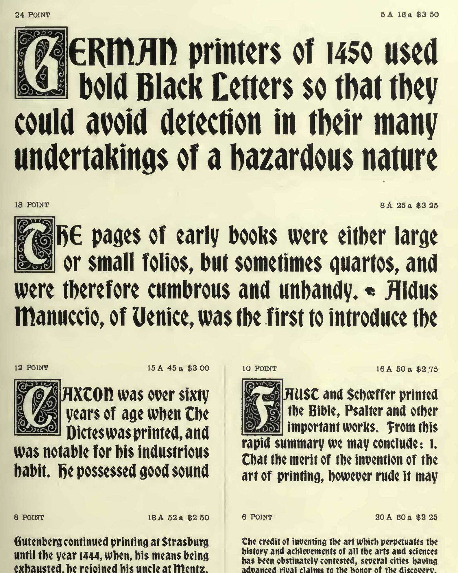
font pairings
font Suggestions
the effect of low resolution on e-ink screens is quite similar to the appearance of the newspaper where low-quality paper with high soaking ability tends to distort fine details of letter shapes. So the same typefaces that are used for setting the text in newspapers - low-contrast, with thicker serifs and larger counters - something like Zócalo Text, Swift, PF Adamant etc. could be good
font selection could also be based on lenght of text (ie size of text)
font-variant: small-caps;
Bookerly by amazon (though it's kind of boring)
Literata: made for ebooks
Gill Sans - Small Caps
❦ ❧ FERN
cnn stencil
assuming that the latest highlight is from the next chapter is a poor assumption. A better way would be to search through the e-book chapter list but that involves actually getting the e-book file and then scrapping random HTML files which is fraught and ultimately not that different from what I already do...