Matt's Roof Garden
Powered by 🌱Roam GardenDigital Garden
A digital Garden is a living record of a person's thought process. Much like a real garden it's intended to be messy, alive. Similar to the idea of
sort pages by link density
the more interconnected the page is the higher it shows
maybe the top linked pages are showcased in the intro
What about changing it to a Digital Roof Garden?
Kind of illustrates that there is lots going on underneath
Roof garden of The Company?
Embed hypothes.is sidebar
config
<script type="application/json" class="js-hypothesis-config">
{
"showHighlights": true,
"branding": {
      appBackgroundColor: 'white',
      ctaBackgroundColor: 'rgba(3, 11, 16, 1)',
      ctaTextColor: '#eee',
      selectionFontFamily: 'helvetica, arial, sans serif'
    }
}
</script>
<script async src="https://hypothes.is/embed.js"></script>
should change scheme depending on dark mode
Bookshelf
Practically the bookshelf is created by referencing namspaced books Book/. During basic page creation all book pages are collected and analyzed. Relevant attributes are scooped out and applied to a pre-made book template page (which ends up replacing). The book and cover are then added to a separate Bookshelf page with a pre-made template. My old annotations site can be referenced.
Linked in the NavBar, the bookshelf is one of the primary pages for the garden
Clicking on the book cover brings up a modal of the selected page
Book/ Query
Maybe use bookish.tech somehow?
Random highlight button?
Sort by tag or favorite
Favorite words
Include a page to showcase my list of words
Include custom JS or css as an attribute on the page
Style::
Favorite Recipes and thoughts about them
Media Recommendations and what makes it special
Could include a /now page about what's happening now
{{embed: ((
Article/ pages should be handled carefully. Instead of displaying the Content attribute should I somehow embed the actual page? I don't want to be re-hosting someone else's work without permission..
Issue № 1
Pages should have a last edited timestamp

A garden could include a personal timeline
Exemplars
love the sliding layering of notes
love the popup summaries
Toby Shorin's website
love the subtle z-level raising of external quotes
Aengus McMillin's website
love the changelog for the site on the front page
joel hooks's website
toggle light/dark mode
pain points:
both themes are too extreme. Light and dark should be softened
he uses short declarative sentences, not great to read or look at
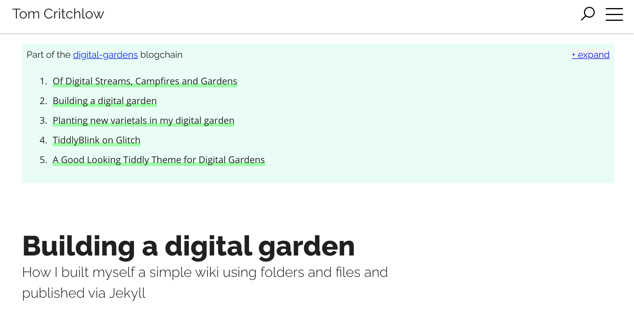
Tom Critchlow's garden
Has a collapsable 'blockchain' of ideas ie notes that build on each other in sequence
josh wcomeau blog
excelent link highlighting
great popup previews
sexy typography and layout combo
includes a photo of where she read the book, very cool idea!
makes use of footnote symbols (* † ‡ § ¶ ↗︎)
pain points:
site is a single page with poor discoverability
only laid out for few highlights and a short blubs
nice use of screen real estate
each highlight can be lined directly to
nice subtle animations on page load
great hover animation
Cons: everything is a page and there's a lot of lag
nice mix of commentary and quotes
good use of marginalia
nice all book filtering options
pain points:
on desktop wastes screen space
nice compact layout at top
previews are 'attached' to link
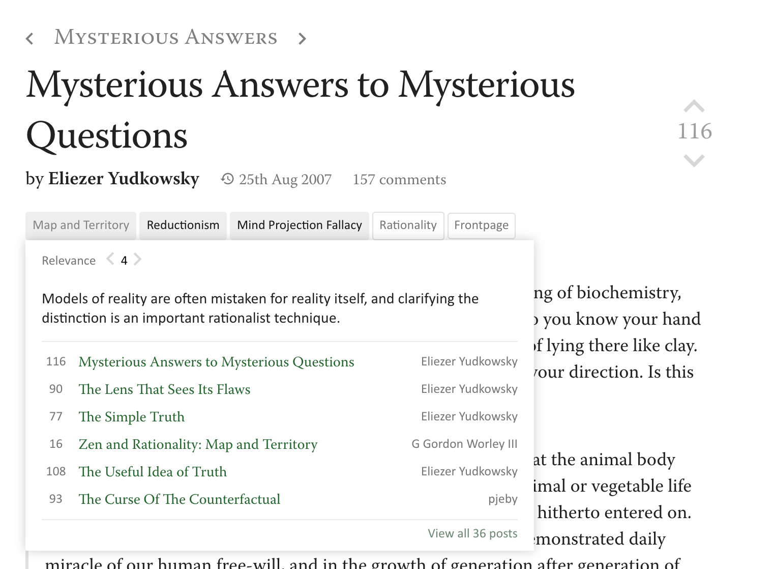
page previews have nice layout
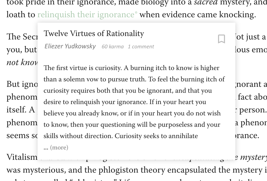
"A "meditation" is a puzzle that the reader should attempt to solve, or a prompt that the reader should try to state their own reaction to, before continuing. Research shows that you're much more likely to remember useful info if you try to solve the problem yourself before reading the solution. Succeed or fail, the important thing is to have tried first."
pain points:
No color, everything is shades of gray
everything is muted and tight, no intentionally mismatched typography or designed layout
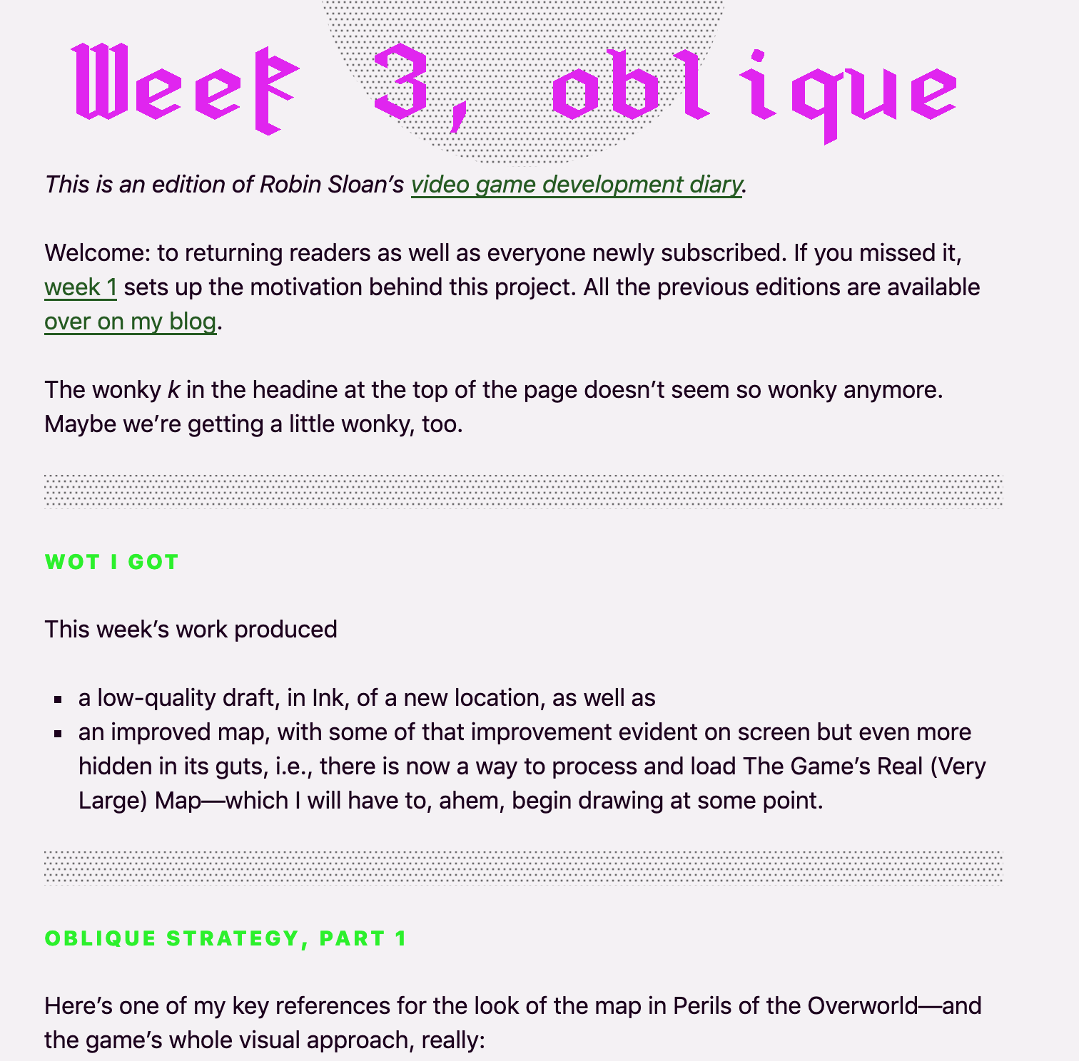
very cool side scrolling layout
really nice typographic layout and hierarchy
smaller font size than I expected
font - SF Pro Display
images are handled cleanly with css shapes
doesn't feel like a bulleted list
pain points:
normal and boring on mobile
navigating to different pages is cumbersome
Clicking on a shortcut opens it up to show some explanation text and a walkthrough gif
Nice use of subtle Visual Delight
uses craft.do
can switch between matuschak mode and regular blog mode
has breadcrumbs at the top to show your path through
page widths are relatively large by default, only 1.75 can fit on a screen at once (maybe too large?)
code snippets have slick popout with syntax highlighting and one click copy functions
page links show up as embeds with page preview and hover enlarge css. This is stylistically nice but actually takes quite a bit of screen realestate
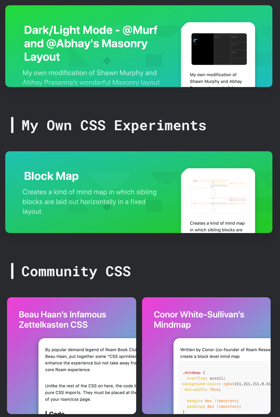
jzhao.xyz - this digital garden is so good it almost pisses me off
Public Bookshelves
Lessons learned: A good garden is...
image & diagram heavy
Whatever minutiae of human experience I'm interested in
To Read
Referenced in
February 26th, 2021
Digital Garden Recipe at the Top ideas should have a surprise me button that will take you to a random recipe page
September 7th, 2020
My Digital Garden could have programming cheatsheet section similar to devhints.io
July 29th, 2020
I've been thinking about Person/Maggie Appleton's Digital Garden and her analogies for the growth of Evergreen Notes.
How to communicate with empathy and collaboration
Stage 3 Success: A published draft as part of a Digital Garden
About these notes
These notes are a first attempt at a Digital Garden and as such are a little wild and untamed. There's no central index or table of contents; you explore by going deeper and deeper down the rabbit hole.
Archive/Delving into the wild world of [[Gatsby]] to create a [[Digital Garden]]
> 🚧 This page is an experiment in learning in semi-public. Misc bits I learn about Gatsby will be recorded here on the way to creating an automated Digital Garden that pulls from Roam Research 🚧
July 13th, 2020
As a polymath what kinds of blogs are there out there and how can I have sections of my Digital Garden devoted to similar ideas
September 13th, 2020
My Digital Garden should be uniquely me. What preoccupies my brain? What ideas inspire me? What minutiae of human experience do I investigate? Am drawn towards?
August 8th, 2020
notes should be an open stream running through your Digital Garden from source material to Evergreen Notes
NOW
The NOW page is an interesting addition to a Digital Garden which differs from an ABOUT page in a few key ways
October 24th, 2020
I built this... thing for my writing. It's kind of like a personal website but different. Not really sure how to describe it but it's based on curiosity trails, very little professional architectural writing there right now but it was a way to experiment with thought design and non-linear structure and experience. A Digital Garden of forking paths if you will
October 16th, 2020
New ways of roam graph visualization similar to http://www.histography.io/ in my Digital Garden
